All work
Case study · STFC web store
A store full of bundles. No way to find one.
Star Trek Fleet Command sells bundles through a web store alongside its in-game one. Nearly 20 million downloads, hundreds of thousands of players a day, and no search. I redesigned finding, filtering and deciding, on mobile.
01The problem
The store was hiding its own inventory.
01
Nothing to search with
No search field, no filters, and no way to hold two bundles side by side. What a bundle contained sat behind a click.
02
A workaround, desktop only
Desktop players had invented one, Ctrl+F. On mobile there was nothing to invent.
03
A 30% margin at stake
Web purchases skip the commission Apple and Google take, so the business pays players bonus credits to shop here rather than in game.
What the absence was costing
The most valuable place a player could spend was the hardest place to spend. Every purchase that gave up and bought in-game handed 30% back.
Find it, narrow it, decide. An independent UX Tree concept project. I was not employed by Scopely or Digit Game Studios. The research is mine, run with real players.
Daily-player figures reported by Digiday, December 2023.
02The baseline
Nobody needed convincing to shop. They needed to find the thing.
5.2
out of 10, average rating for how easy it is to find an item
67.8%
opened the store daily, already in the habit
85%
had already bought on the web store at least once
Three of sixty players rated findability 9 or 10. The traffic was not the problem. The last step was.
Source
My own survey of 60 STFC players, February to May 2025, recruited through the game's own communities.
03What research changed
They already knew what they wanted.
Not awareness
85% already bought here. The business did not need more traffic, it needed the traffic it had to stop failing at the last step.
Two entry points
Name-knowers arrive with a bundle name from alliance chat or Discord. Need-knowers arrive with a resource they are short of and no idea which bundle carries it.
Near-identical by design
The catalogue is full of bundles that share a name and an item list, differing only in quantity. This shaped everything after it, and search cannot solve it.
One search field serves the name-knowers and abandons the need-knowers.
Sixty survey responses and nine interviews over Discord, 61.7% of them playing more than three years, is how I found that out.
04The concept
Three additions. Nothing to relearn.
01
Search
Two ways in. A name field for name-knowers, category and resource chips for need-knowers.
02
Filters
That show how many bundles survive before you commit to them.
03
Comparison
Built for the case the research found, two bundles that look the same and are not.
Additive, inside the store's existing design language. A redesign would have been a better portfolio piece and a worse answer.
Mobile web only, deliberately. One person, part-time, so one platform fully rather than two platforms partly.
05Key feature 1 · the core workflow
Two ways in, because players arrive two ways.
Name-knowers
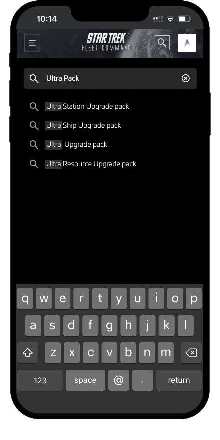
Type four letters, get bundle names back, land on the one you came for. Typing returns names, not results: a bundle card is tall, so under an open keyboard a results grid shows a fraction of one card.
Need-knowers
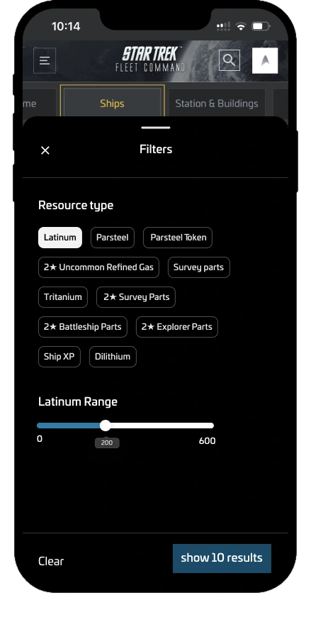
Two chip sets sit under the field before you have typed anything. Nine store categories, and resource type in the game's own economy: Latinum, Parsteel, Tritanium, Speed Up. Filters extend it with a quantity range, because players search by how much a bundle holds.
A live count
The apply button counts as you filter, twenty results becoming ten before you commit, so nobody filters their way onto an empty page.
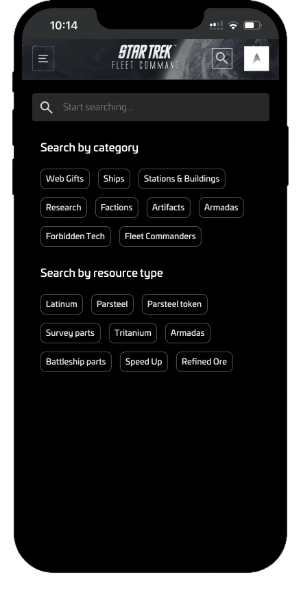
Chips before you type, names as you type. Four letters in, names arrive rather than results. Then a filter sheet that narrows by resource, with a range and a count on the button.
06Key feature 2 · the trade-off
The card already sold hard before I touched it.
Inherited
Mega Value across the top, 1 Left at the bottom. Both the store's, and both persuasion. I could add to this card, not remove from it.
Added
Three things, all of them information. The contents, so nobody clicks to find out what is inside. A way to hold two bundles side by side. And a buyer count.
Why the count
The count came from research. Players were already leaving the store to check Reddit and Discord on whether a bundle was worth it. The information existed, it just lived somewhere else, and going to get it was how purchases died.
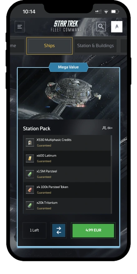
- Inherited
Mega Value
The store framing its own price.
- Added
Buyer count
How many players had bought it.
- Added
Contents upfront
What is inside, without a click.
- Added
Compare
A way to hold two side by side.
- Inherited
1 Left
A purchase limit set by the store.
Five elements, two of them the store's already. The three I added are all information, and the one that needed most thought is the smallest.
07Key feature 2 · the line
The line between evidence and pressure.
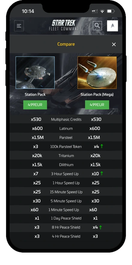
The comparison table marks which bundle gives more of each item, then stops. No best-value badge, no total, no recommendation, because I wanted the player to decide, not the store.
The buyer count is where that principle got tested. In usability sessions it was the element players responded to most: a higher number meant more trust. That is the feature working, and it is the part worth sitting with.
A number that makes someone trust a purchase is, from the other side of the screen, a number that makes them more likely to spend.
At the time
I put no constraint on the count. I did not foresee the manipulation risk.
What I would do now
Constrain it. A count is information as long as it reports what happened.
Where it turns
The moment it is engineered, made urgent, or attached to whichever bundles the store most wants to move.
08The shift
Finding it is not the same as choosing it.
Before
Search and filters, and the store stops hiding its inventory. That was a complete answer to the problem as stated.
Then the catalogue changed my mind
Search takes a player to Station Pack. It does not tell them the bundle beside it, at the same price, gives more. So the work grew a third feature: comparison, shaped for near-identical bundles.
Why a centre spine
Item names down the middle, each bundle's quantity either side, arrows marking whichever gives more. A conventional table puts labels left and columns right, which on a 375px screen means horizontal scrolling.
Comparison starts from a bundle card, not a separate section. Comparing is not a task players plan, it is something they realise mid-browse.
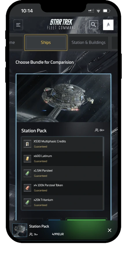
Picked mid-browse, then held side by side. Quantities, then arrows for whichever gives more, and no winner named: the store's call, not mine. Prototype data, modelled on research.
09The final experience
Find it, narrow it, decide between what is left.
Three screens, in the order a player meets them.
Scope
Mobile web only. Every screen here was drawn at 375 points wide, and the decisions were made at that width rather than shrunk to fit it.
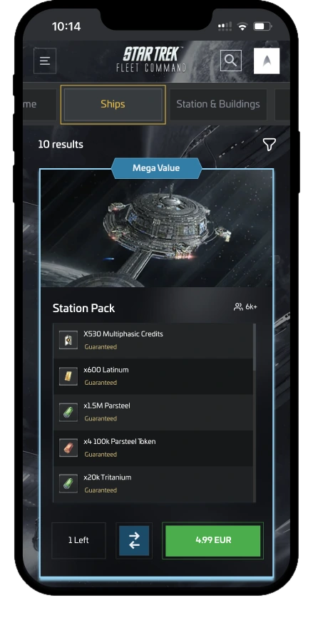
Ten results, and the bundle you came for. Contents on the card, and the buyer count in place. Then quantities either side, arrows marking more, and no verdict.
10What came of it
Sixty-nine players, for a project nobody commissioned.
0
players, self-recruited through player communities. 60 surveys, 9 interviews.
5.2
out of 10 findability, the baseline the work was aimed at.
71.2%
named better filtering as the single thing that would help them most.
Tested with two
Both found it smoother than the live store, both singled out seeing bundle contents upfront and comparing side by side, and both wanted more flexible filtering than I had built.
Footnote
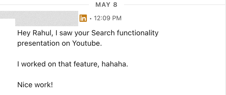
After I published the project, a designer who had worked on the actual STFC search feature messaged me unprompted. Independent work, same destination. Direction confirmed, not an endorsement.
11Retrospective
Fix the basics, then watch what the fix does to people.
Nothing here is a novel pattern. Search, filters and comparison are e-commerce basics, and the insight was that their absence was quietly taxing every purchase in the store the business most wanted people to use.
What stayed with me is the second thing: the buyer count worked because it was true, and it moved people because it was persuasive, and those are the same property viewed from two sides.
Would change
More participants
A measured outcome rather than an impression.
Would extend
Harder comparisons
Mismatched contents, unequal prices, and more than two bundles at once.
Took forward
Commercial is not neutral
Commercial surfaces need the same scrutiny as safety-critical ones.
That's the short version.
See other work
All work