All work
Case study · Revature
They could see the curriculum. Only engineering could change it.
I was Revature's first in-house designer, and the only designer on the platform built to change that, from a blank Figma file to a shipped MVP.
01The bottleneck
The problem was not the interface. It was the queue.
01
Read-only by design
Trainers and content developers could see schedules but could not touch them.
02
Engineering as gatekeeper
Moving a class or reshaping a week meant raising a request and waiting for a backend engineer.
03
Not client-presentable
Sales had no usable way to walk prospects through what Revature actually taught.
Removing an engineering dependency was the design problem. The interface was only where it showed up.
What the tickets were actually costing
The real cost was never measured in days. It was that a trainer with a cohort in front of them had to stop teaching and become an administrator to get a single day moved.
The curriculum library. Search, filter by competency, open one. It runs.
02The evidence
No research function, no precedent, first designer in the building.
Had
Direct access to trainers and content developers, and a legacy system to interrogate.
Did not have
A research practice, personas, prior studies, or a design system to inherit.
Pointed at
Findability was the unmet need. Not features, not visual polish. People could not locate what they already had.
Search and filtering drew the strongest reaction of anything I showed them. Not because it was clever. Because the old system had nothing like it.
03The model
Three objects. Get them right and the product follows.
01
Curriculum
The programme a cohort runs through, ending in a mandatory capstone.
02
Competency
The skill areas inside it, and the way a curriculum gets filtered and found.
03
Unit
The reusable teaching block. Built once, dropped into other programmes rather than rebuilt each time.
Open the curriculum, find the week, move the activity, done. No request, no engineer, no wait.
This is how the queue died. The hierarchy was the mechanism, not the screen.
One curriculum, opened. Units are reusable: pick one up and the row closes behind it.
04Before vs after
From a table you could read to a schedule you could run.
Before
A dense table with its metadata stranded in a legend underneath. You cross-referenced a key to read it, then filed a ticket to change it.
After
A ten week programme scannable in one pass. Descriptions moved onto the curriculum cards, so information sits on the object it describes.
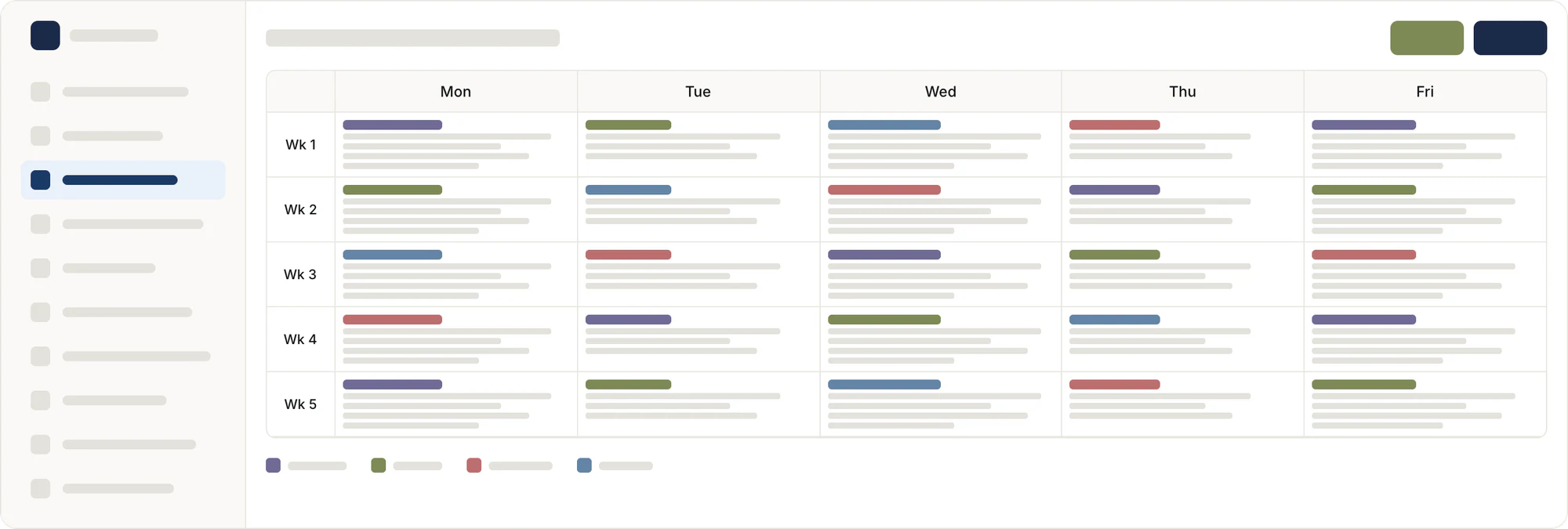
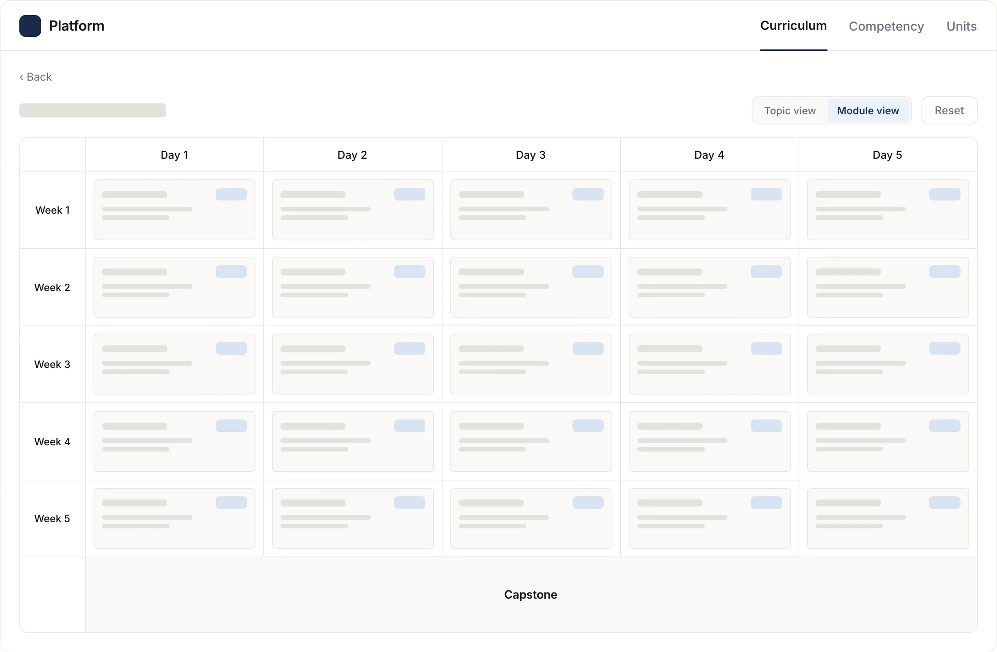
The same five weeks, same frame, same scale. The new one is twice as deep.
05The drag
Moving one activity is never about one activity.
The friction
Two days, one move
A move changes the day it leaves and the day it lands on, and both have to stay coherent. Most of my time with engineering went on this: drag behaviour, what happens when a day is extended, how much freedom a trainer gets.
The call
Constrain, or inform
Stopping someone building an overloaded day means inventing rules for work we do not do. So we surfaced the cost instead: daily load, shown per day, changing as the trainer moves things.
The schedule, being changed. Move an activity and the load map answers for both days.
I could not stop someone creating a bad day. I could make sure they saw it happening.
06The third view
I built the wrong view first.
Sales needs to know what exists. Content developers build the structure. Trainers live inside a single day. Same data, three depths.
My first pass was a module view, organised by competency. Trainers and content developers came back asking for a day-level view I had not built.
Three objects · what the data is
Curriculum, competency and unit. That hierarchy never changed, and everything hangs from it.
Three views · how it gets read
Topic, module and activity. Three depths of looking at the same thing. That is what the feedback added.
07What shipped
Twenty features, ten screens, in production.
Find a curriculum, open it at the depth you need, build and reuse the pieces, schedule the work, export the detail.
Every screen that shipped: browse and search, the three depths, unit templates, scheduling and export.
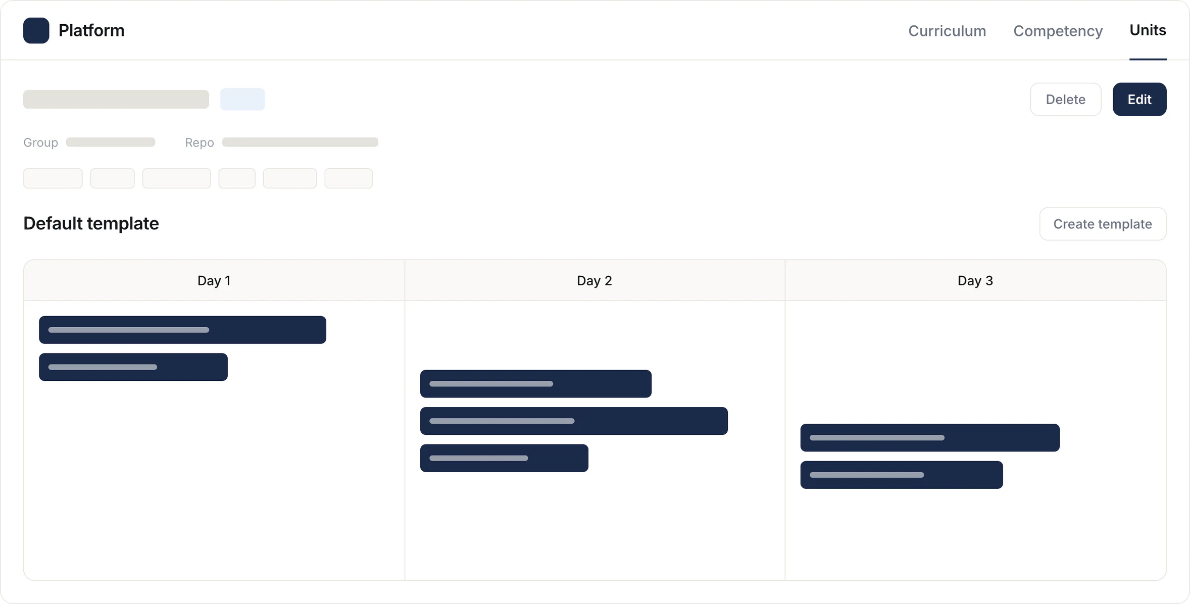
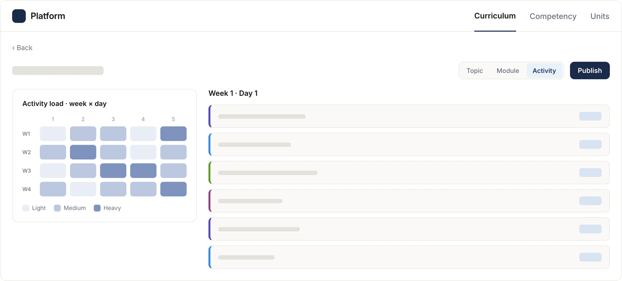
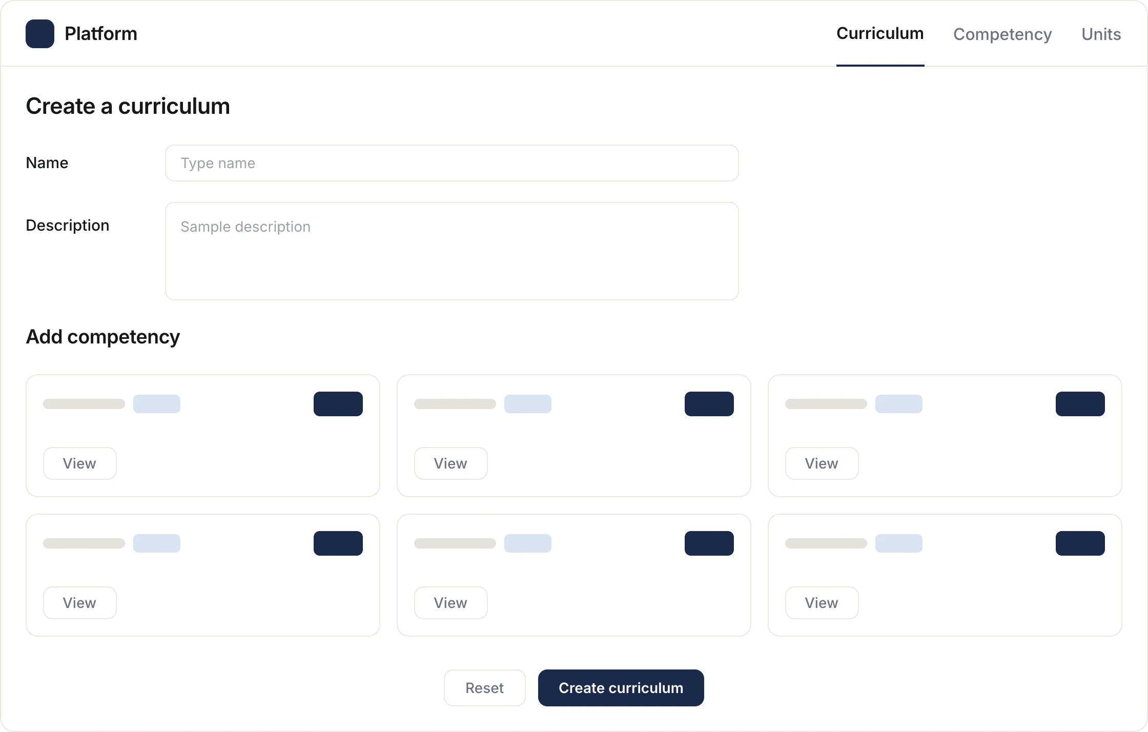
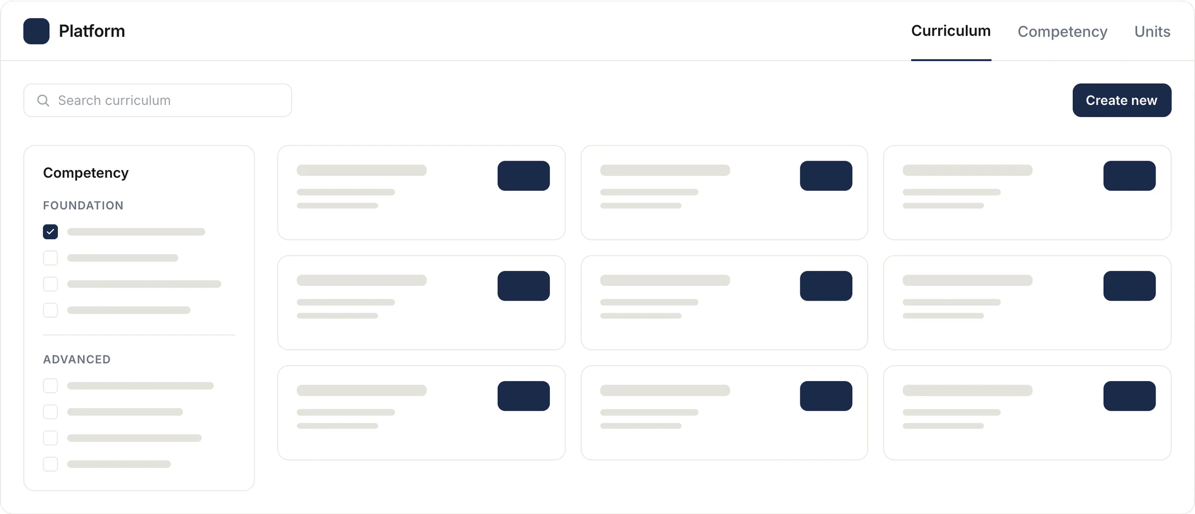
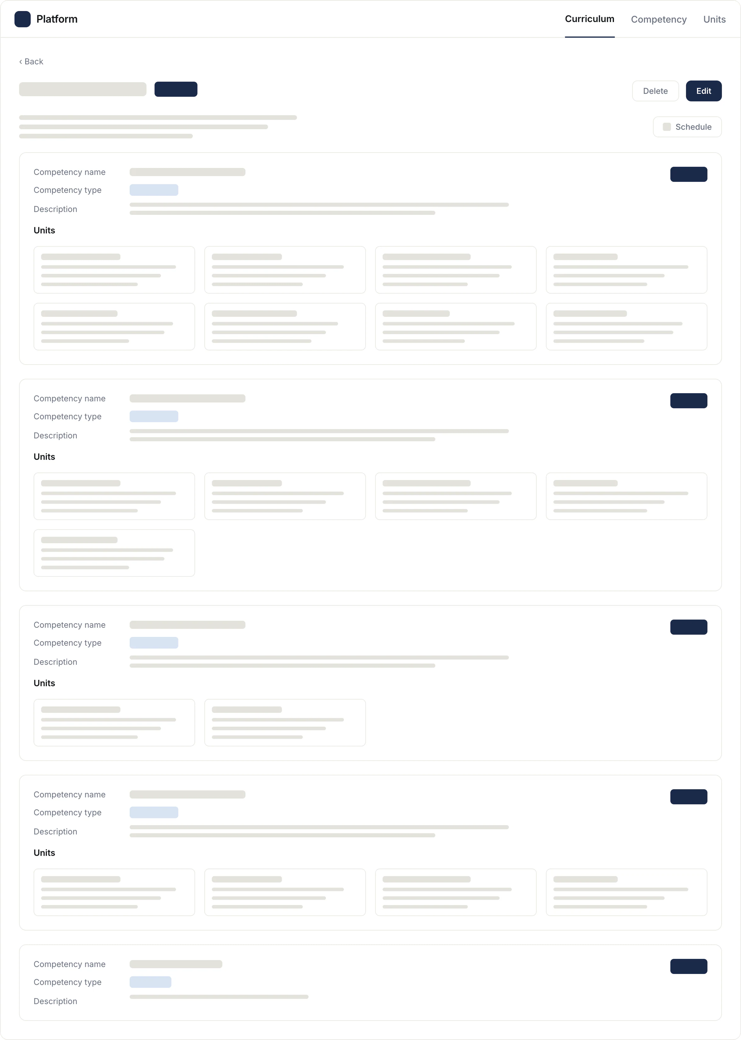
Ten screens, one system. Browse, the three depths, unit templates, scheduling, export.
08The outcome
Shipped, trialled, handed over as the baseline.
0
features designed across the core workflows
0
screens built for a 0 to 1 MVP that shipped to production
0
user groups of roughly 20 to 30 each: trainers, content developers, sales
Before, changing a curriculum required an engineer. After, it required nobody.
Scoped deliberately
Editing a curriculum mid-cohort needed stakeholder alignment that would not fit the timeline, so it went to phase two rather than getting half-solved. Trialled with sales and presented to the heads of sales and content development, who backed the direction.
09The reflection
I would have shown people sooner.
Giving a layered system a structure people can navigate without a manual is the skill I took from this. Getting there faster is the one I am still working on.
Status
Shipped to production
Trialled with sales, handed over as the baseline.
Role
First in-house UX designer
End to end, the only designer on the product.
That's the short version.
See other work
All work