Case study · Side Hustle · Trinity College Dublin · 2023–24
Side Hustle: a co-op RPG, from paper sketch to Unreal ggmu
A cooperative, turn-based RPG for PC, built by a team of six for our Master's showcase. I owned the game UI with my teammate Abhishek, from whiteboard scribbles to widgets running in the engine.
UIRole
Game UI Designer · sketch to engine
0Team
MSc Interactive Digital Media
UEShipped in
Figma designs → Unreal Engine widgets
Scroll to begin
01
01The setup
Six people, one summer, one game
Intervene · Distract · Manipulate: mercenaries for hire in a space colony.
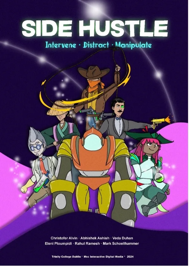
The showcase poster: the game's cast in its hand-illustrated, purple-soaked art style.
Side Hustle is a cooperative, turn-based RPG for PC where players act as mercenaries in a futuristic space colony. It was the summer project of my Master's in Interactive Digital Media at Trinity College Dublin, created with a team of six, each of us taking on roles: game designer, level designer, game UI designer.
My primary focus was the UI design, working closely with Abhishek. We iterated on every screen through team discussions, with the guidance of our supervisors, Mads and Sam, sharpening the final outcome.
06Teammates, every hat between usTeam
02On the UI: me and AbhishekUI duo
02Supervisors: Mads & SamGuidance
01Engine: Unreal, learned on the jobBuild
01Sketches → wireframes → final screens → widgetsMe
02
02Research
Doing the genre homework
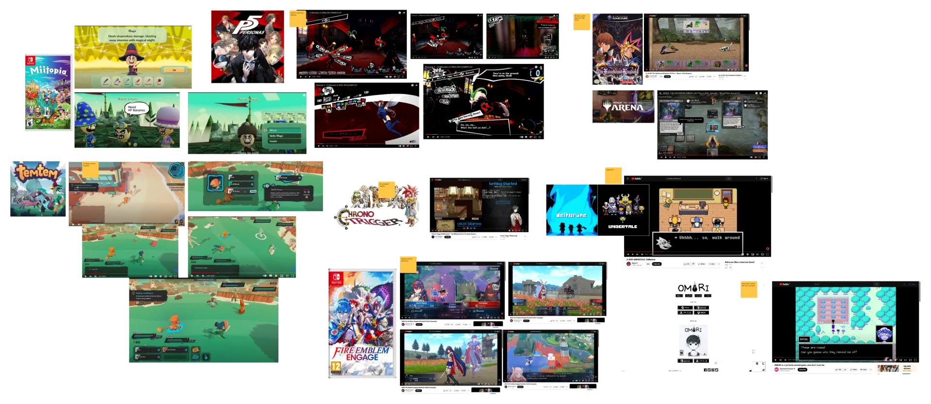
The project began with brainstorming sessions where the team explored concepts and landed on a turn-based RPG. To understand the genre, I analysed games like Honkai Star Rail and Pokémon, pulling out the essentials: clearly displayed stats (HP, XP, energy) and navigation you never have to think about.
Those insights fed a set of mood boards that established the game's visual language: futuristic palettes and typography that had to feel like adventure, aligned with the sci-fi theme.
The UI moodboard: how other turn-based games display stats, menus and combat, annotated with what to steal and what to avoid.
03
03UX on paper
What screens does this game even need?
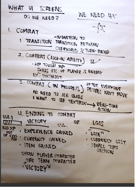
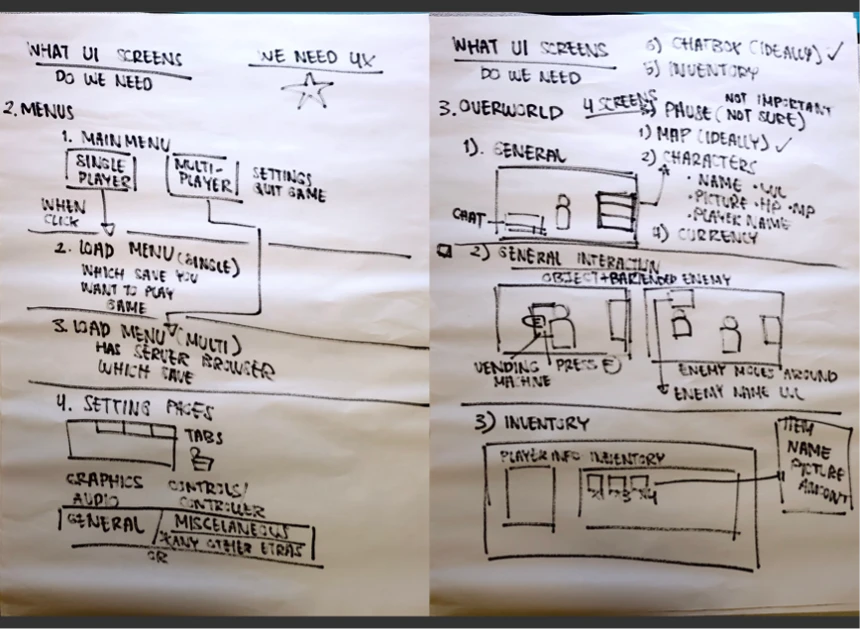
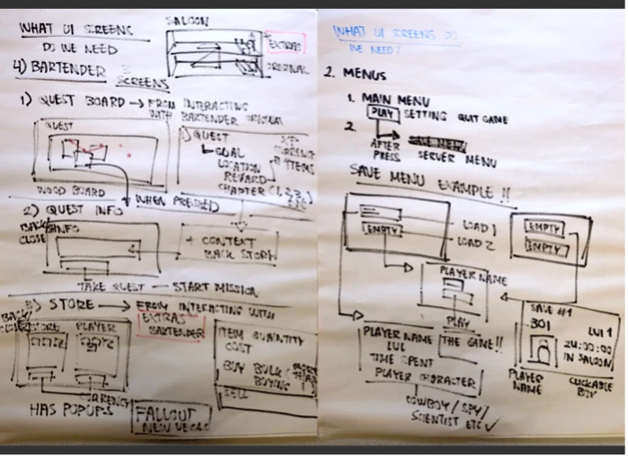
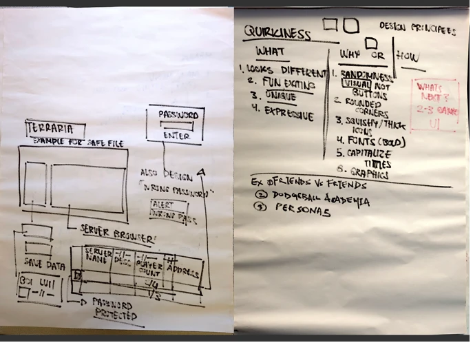
Before touching Figma, we mapped the whole surface of the game on flip-chart paper: combat states, menus and save slots, the overworld HUD, and the bartender's quest board. The same sessions produced our design principle (quirkiness) and the concrete rules to get there: randomness, rounded corners, squishy icons, bold capitalised type.
CombatScreen inventory
Combat needed four states: transition, lock-in, in-progress, and the ending (victory or loss).
Menus & overworldScreen inventory
Menus, saves, settings, overworld HUD, inventory: the unglamorous screens that make a game playable.
Quest boardScreen inventory
The bartender's corner of the game: quest board, quest info, and the store.
Design principleQuirkiness
“Quirkiness” pinned down as rules the whole team could apply, not just a vibe.
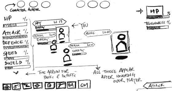
First sketchThe combat screen
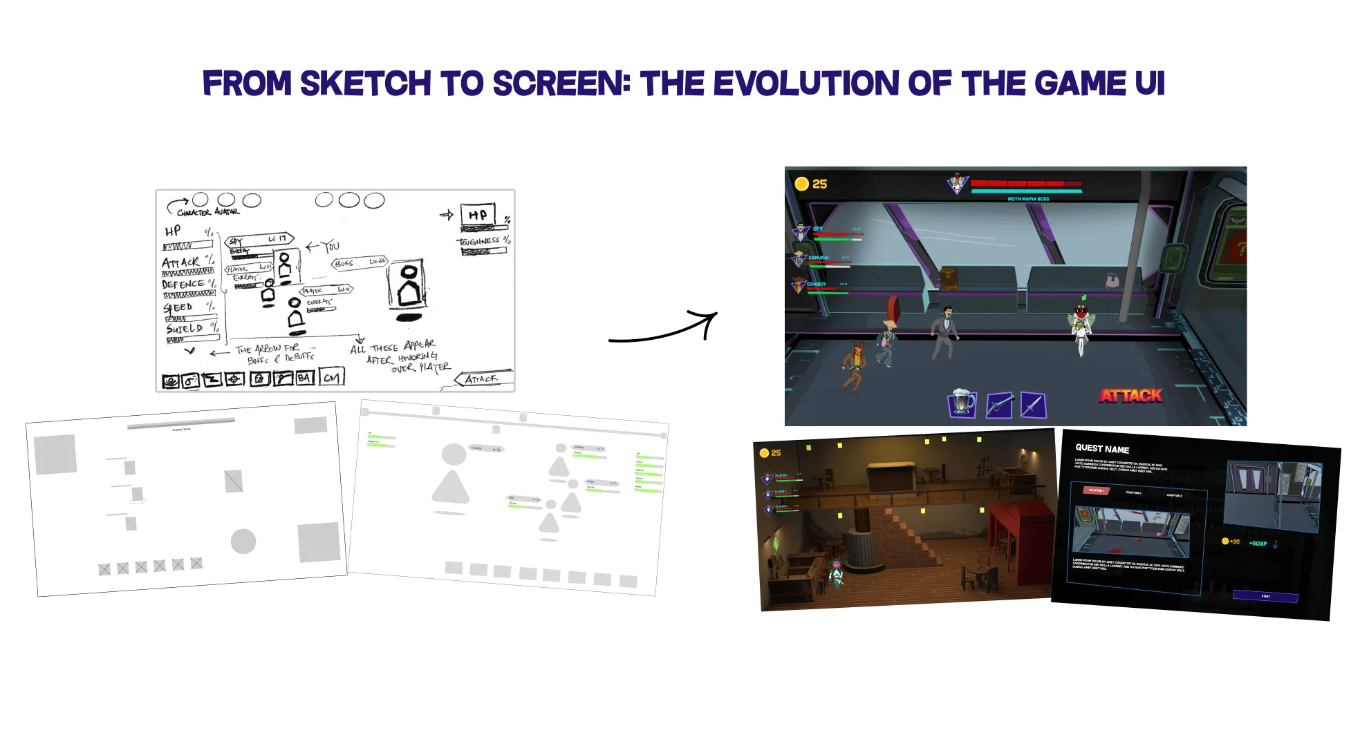
The first pass at combat, drawn by hand: avatars, stats, buffs, a skills row and one big Attack button. Almost everything here survived to the final screen.
04
04Lo-fi in Figma
Iterating the critical screens, cheaply
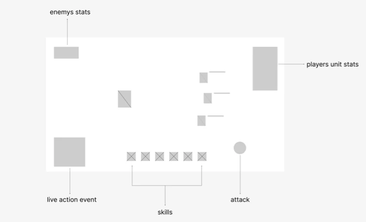
Starting from the sketches, I iterated through low-fidelity variations of every critical screen in Figma. The combat screen was the pivotal one: it had to show stats and actions clearly without overwhelming anyone. And every layout had to hold up in both single-player and multiplayer. For the MVP we deliberately simplified some screens, prioritising core functionality over embellishment.
01 / CombatLayout variations · tap to compare
Main combat screen: testing where enemy stats, unit stats, skills and the attack button should live.
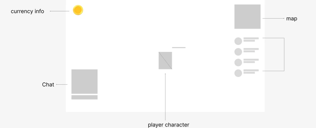
02 / OverworldHUD variations · tap to compare
Overworld exploration: currency, teammates, chat and map, arranged so multiplayer info never blocks the world.
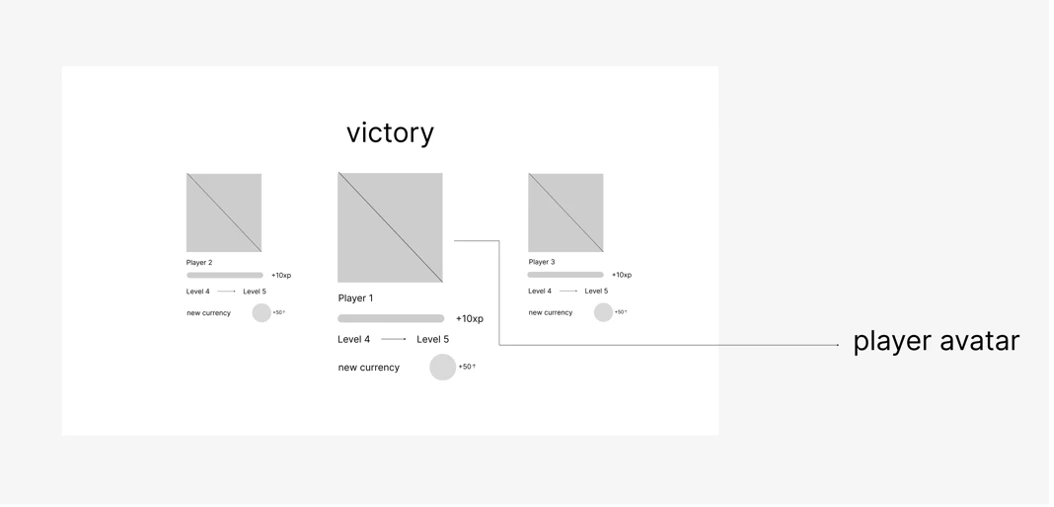
03 / VictoryEnd of combat
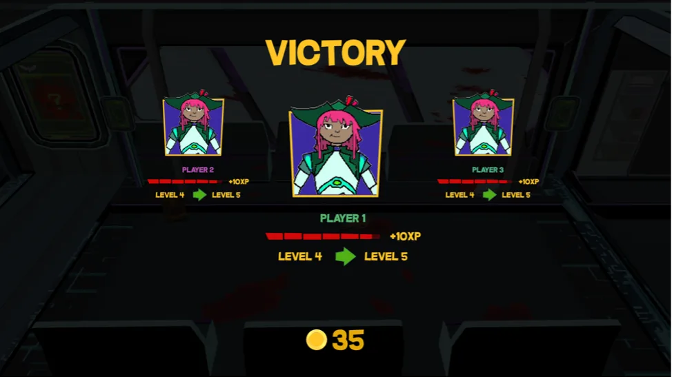
Victory: every player's avatar, XP, level-up and currency in one readable moment.
04 / DefeatEnd of combat
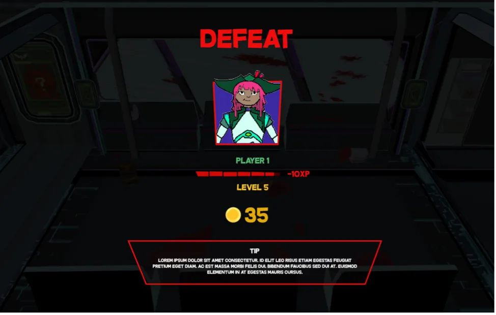
Defeat: softened with a tips section, so losing teaches something.
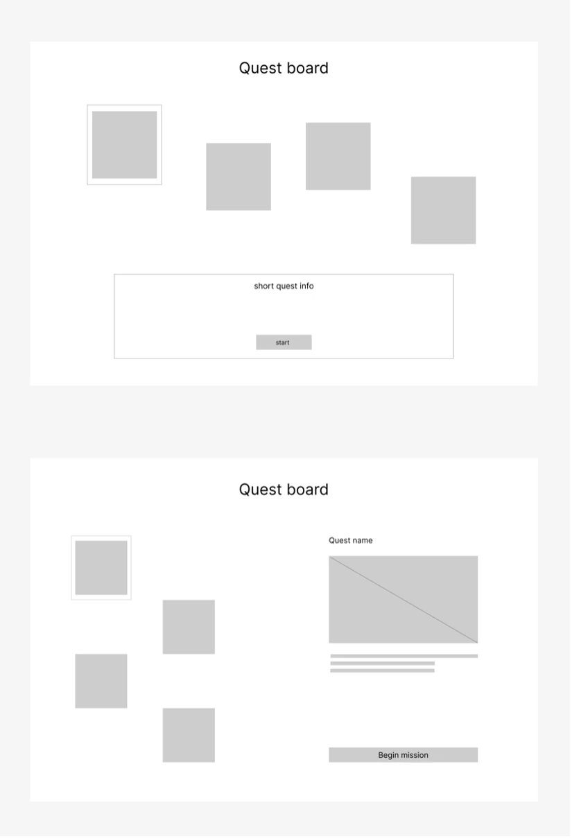
05 / Quest selectThe bartender's board
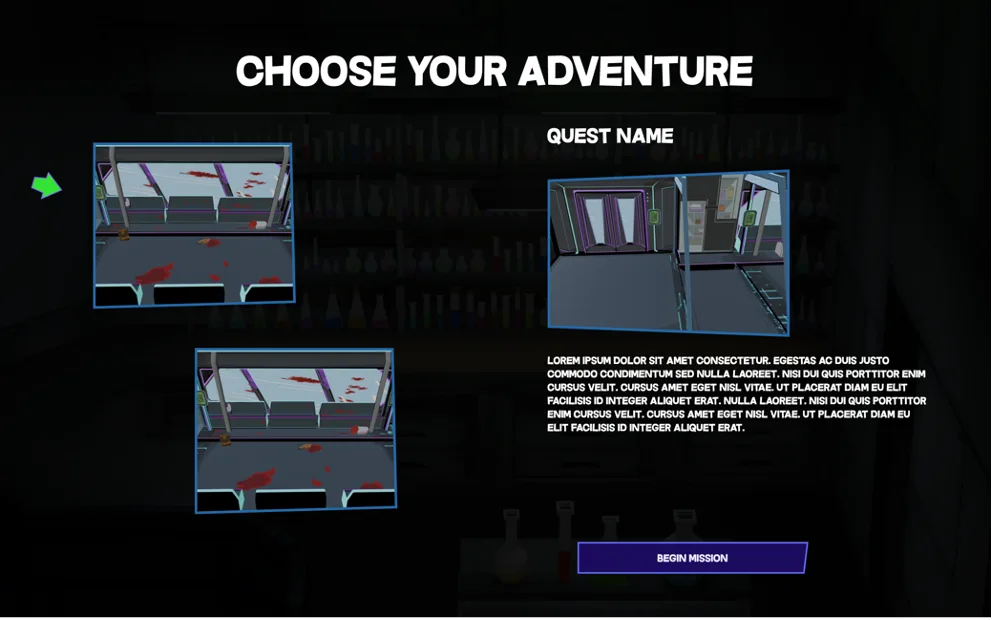
Quest select: from a simple board with a summary strip to a split layout with a proper preview.
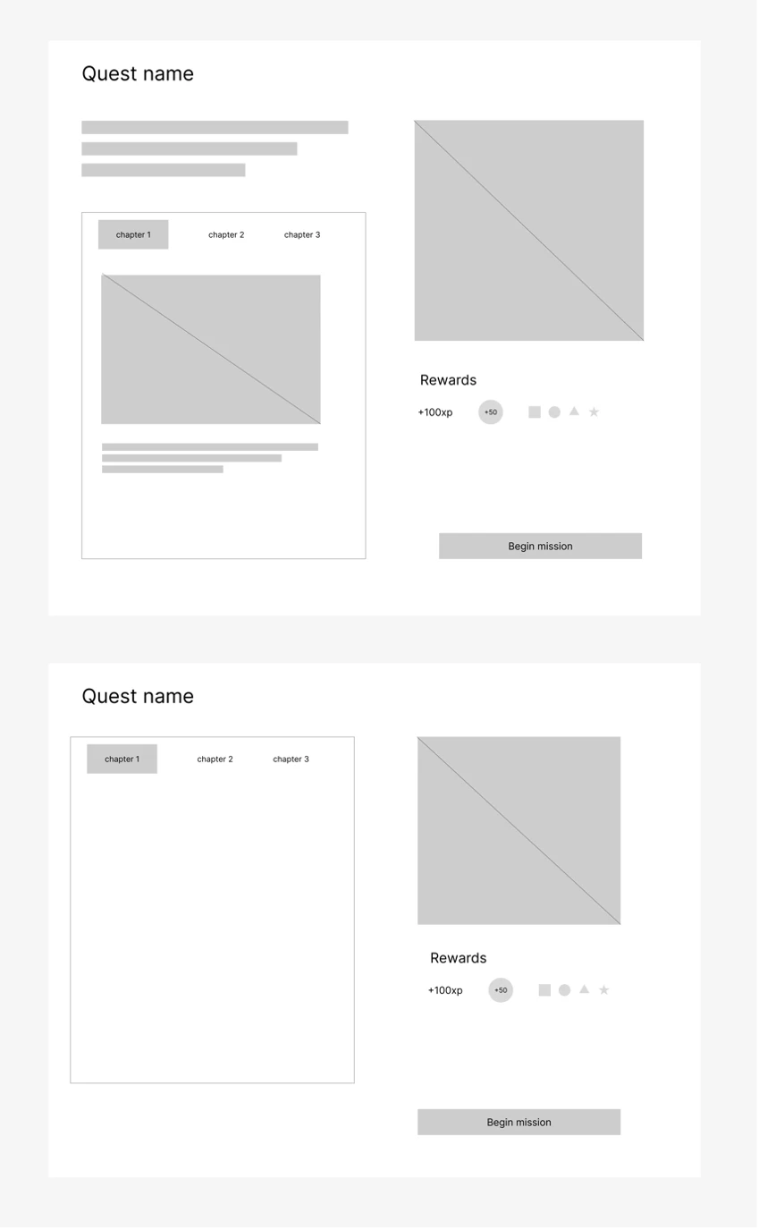
06 / Quest infoChapters & rewards
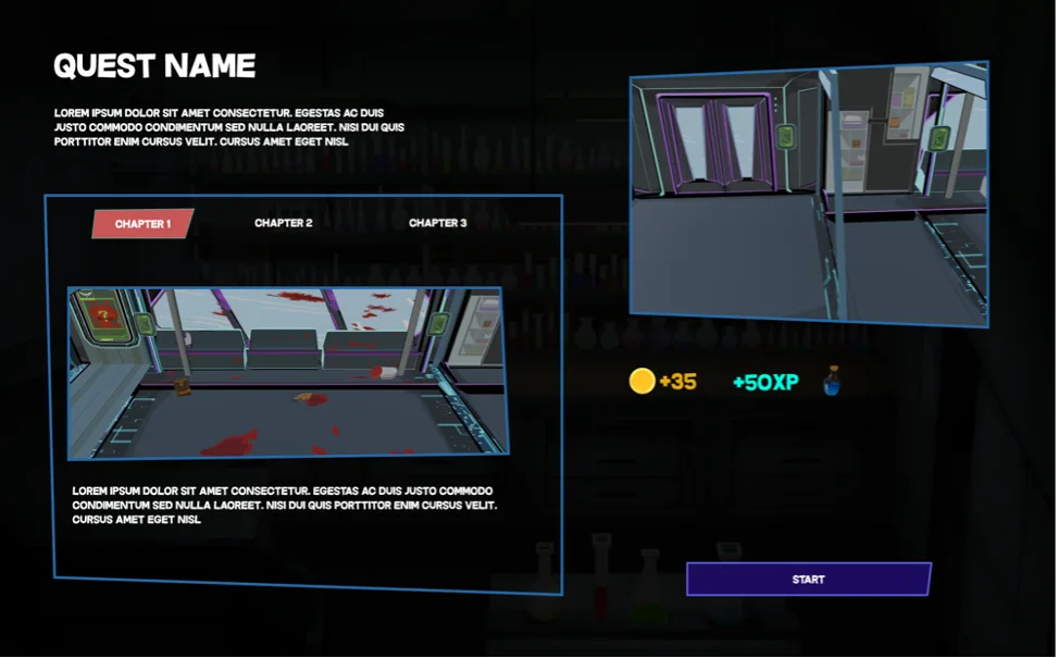
Quest information: chapter tabs, backstory, rewards, and one clear “Begin mission”.
05
05Final designs
Solid colours, sharp edges, sci-fi tone
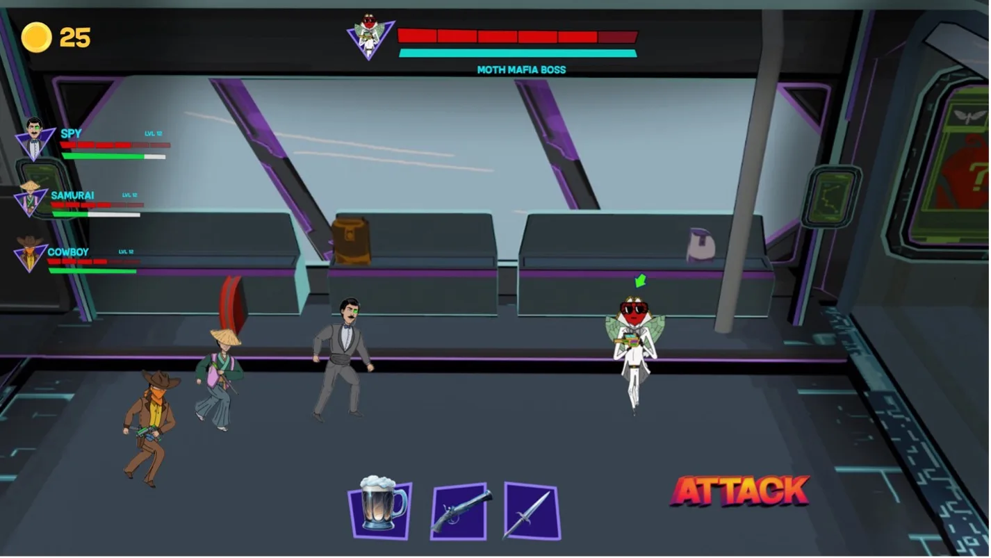
The final screens use solid colour blocks, icon-based buttons and sharp-edged elements to carry the game's futuristic tone. Character icons and progress bars were designed to sit inside the narrative: purple panels, comic-book cast, one big satisfying ATTACK.
Sketch → screenThe through-line
The through-line: hand sketch, grey wireframes, final in-game screens.
01 / CombatIterations · drag to scrub
Frame 1471 / 12
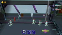
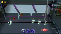
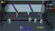
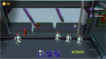
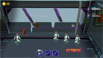
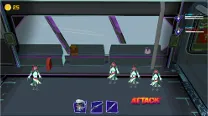
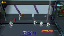
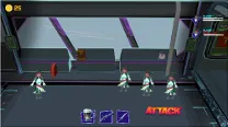
Twelve combat-screen iterations, scrubbable like a flipbook. Most of the arguing happened over one word: ATTACK.
02 / CombatFinal design · drag the handle
SketchFinal
↔
The first hand sketch and the final combat screen, one on top of the other. Drag the handle to see how much of that first drawing survived.
03 / OverworldFinal design
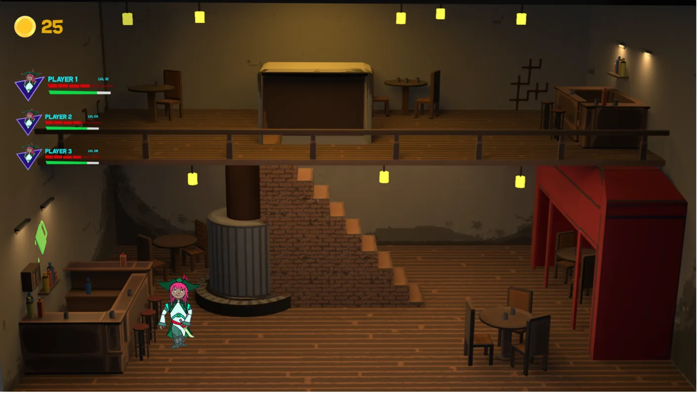
The overworld saloon: the multiplayer HUD stays in the corners so the level does the talking.
04 / VictoryFinal design
Victory: the whole party gets the spotlight, not just you.
05 / DefeatFinal design
Defeat: quieter, redder, and still handing you a tip for next time.
06 / Quest infoFinal design
Quest information: chapters, backstory and rewards on the bartender's board.
07 / Quest selectFinal design
Choose your adventure: the split layout from the lo-fi round, in full costume.
06
06Implementation
Designers don't get to stop at handoff
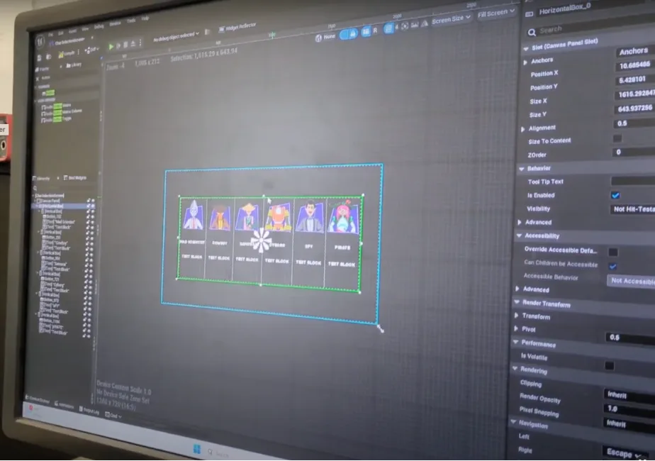
In the final phase I moved from design to development, building the UI as widgets in Unreal Engine. I was new to the platform, so I learned its tools and workflows on the job, translating the Figma designs into interactive elements and testing them against real gameplay. Integrating UI with a live game loop taught me more about designing for games than any static mockup could.
In engineBlockout testing
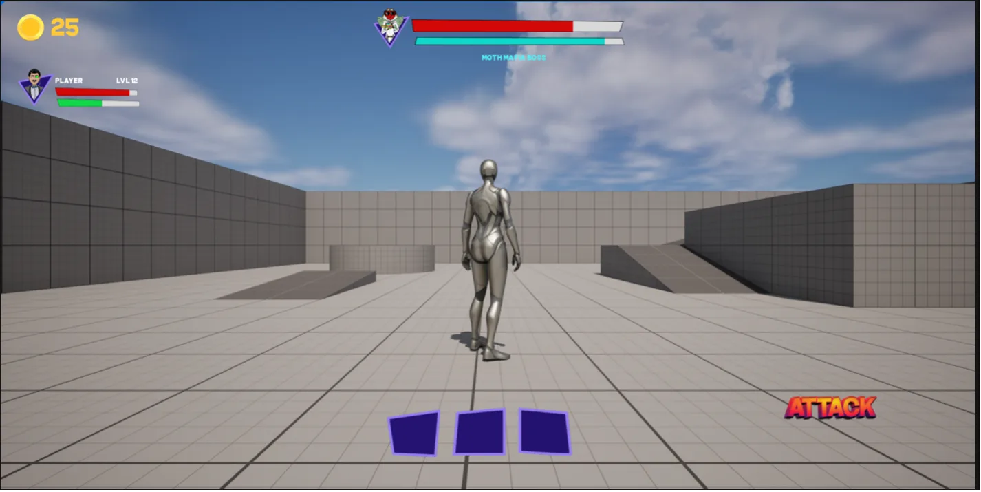
The HUD running over a grey blockout: testing widgets before the art landed.
In engineUMG widgets
Building the character-select widget in Unreal's UMG editor.
Showcase buildBoss fight
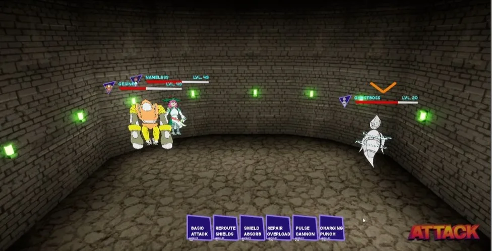
The showcase build: the skills bar and stat plates, live in a boss fight.
Showcase buildMission select
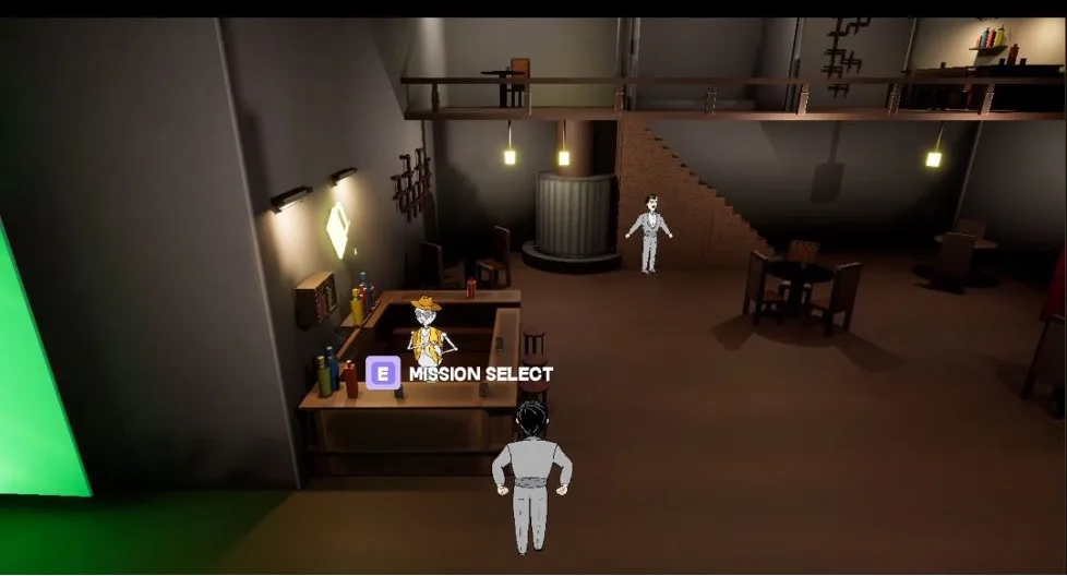
Press E at the bartender: the quest flow, playable.
07
07Reflection
What the showcase taught me
The feedback at the showcase backed the approach we'd taken, and the project gave me the full arc of game UI, from first sketch to engine build. It refined how I balance aesthetics with functionality, and it properly ignited my interest in designing interfaces for interactive media.
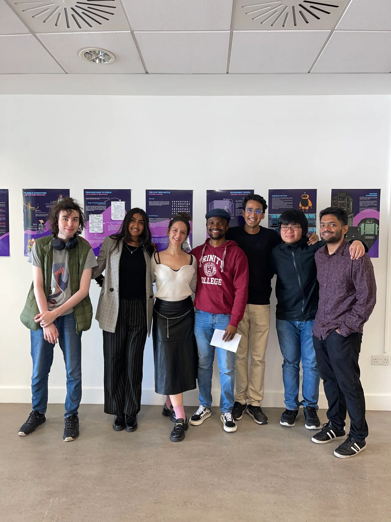
Showcase dayTrinity College Dublin · 2024
The team of six, in front of the posters that started as flip-chart scribbles.
Challenges
Information density in combat
Stats, skills, buffs and three teammates' health, on screen at once, without overwhelming the player. The combat screen earned its iteration count.
One UI, two modes
Every screen had to work in multiplayer and alone, which meant designing the HUD around information that might or might not be there.
A new engine, mid-project
Learning Unreal's widget system while the deadline ran meant simplifying some MVP screens deliberately: core function first, embellishment later.
Learnings
Game UI is a full-stack craft
Sketch, wireframe, visual design, then building it yourself in engine. Owning the whole arc changed how I design for anything interactive.
Principles beat taste debates
Writing “quirkiness” down as concrete rules (rounded corners, squishy icons, bold type) let six people make consistent decisions without me in the room.
Implementation feedback is design feedback
Screens that looked right in Figma changed once they ran against real gameplay. Testing in engine became part of the design loop, not a step after it.
intervene · distract · manipulatesketch → figma → unrealco-op turn-based rpgquirkiness, as a ruleintervene · distract · manipulatesketch → figma → unrealco-op turn-based rpgquirkiness, as a rule
Moth Mafia Boss · LVL 20
Toughness holding · your turn
Moth Mafia Boss0 – 1The partyFull time · MSc showcase 2024 · settled in turn-based extra time
That's the Side Hustle story
From flip-chart paper to a playable build: a game UI designed twice, once in Figma and once in Unreal. Built with five brilliant teammates, and the project that made me want to keep designing for play.
Side Hustle was created by Christofer Alvin, Abhishek Ashish, Veda Duhan, Eleni Ploumpidi, Rahul Ramesh and Mark Schoellhammer · MSc Interactive Digital Media, Trinity College Dublin, 2024. UI shown reflects the collective input of the team and our supervisors, Mads and Sam.